Spring Learning
Challenge
Messy navigation and lack of visual appeal with accessibility
Goal
To create a modern and accessible website
Outcome
A modernized website with improved usability and navigation; improved contrast colors for buttons and streamlined menu items.
Problem
This UI/UX case study explores the transformation of Spring Learning's website, an English school situated in Yokohama, Japan. The project aimed to modernize the website's appearance while authentically reflecting the brand's vibrant and amiable attributes.
Three key challenges were identified and addressed during the redesign process, resulting in a website that seamlessly combines visual appeal with improved usability.
Problem 1
Modernizing the Look and Embracing Brand Identity:
The existing website design didn't match the school's lively and friendly brand identity. It lacked modern visuals and vibrancy, making it less engaging for visitors.
Problem 2
Enhancing Navigation for Seamless Exploration:
Navigating the website was confusing, especially for potential students trying to find specific class information. The main navigation menu was cluttered with unnecessary links, leading to a lack of clear direction.
Problem 3
Prioritizing Accessibility for Inclusivity:
The website's accessibility was compromised due to low contrast text colors and unclear calls-to-action (CTAs). This excluded users with visual impairments and hindered a smooth user experience.
Approach
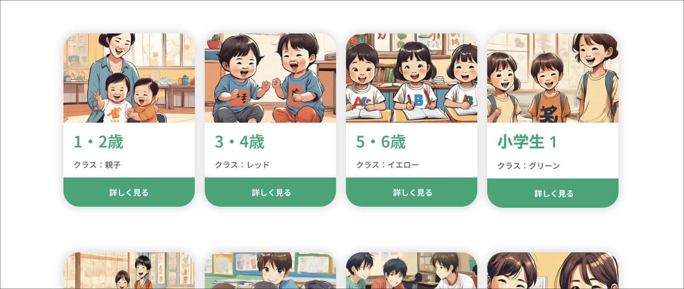
Streamlining the structure
The first task was to restructure Spring Learning’s website in a way that enables potential clients to easily find information about the classes they’re interested on. This was done by adding a navigational landing page with all classes listed according to age group. From there the user can choose the class they’re interested in and read more/ submit a contact form.

Design solutions
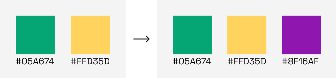
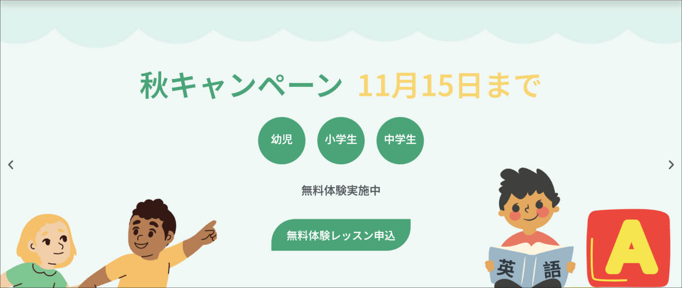
Solution 1: Revitalized Visual Identity:
To address the brand mismatch, we embarked on a visual makeover. We introduced a vibrant purple accent color to complement the existing green and yellow shades. These colors were thoughtfully integrated across the site to create a dynamic and appealing aesthetic. Wavy dividers were added to separate content sections, adding a playful touch.
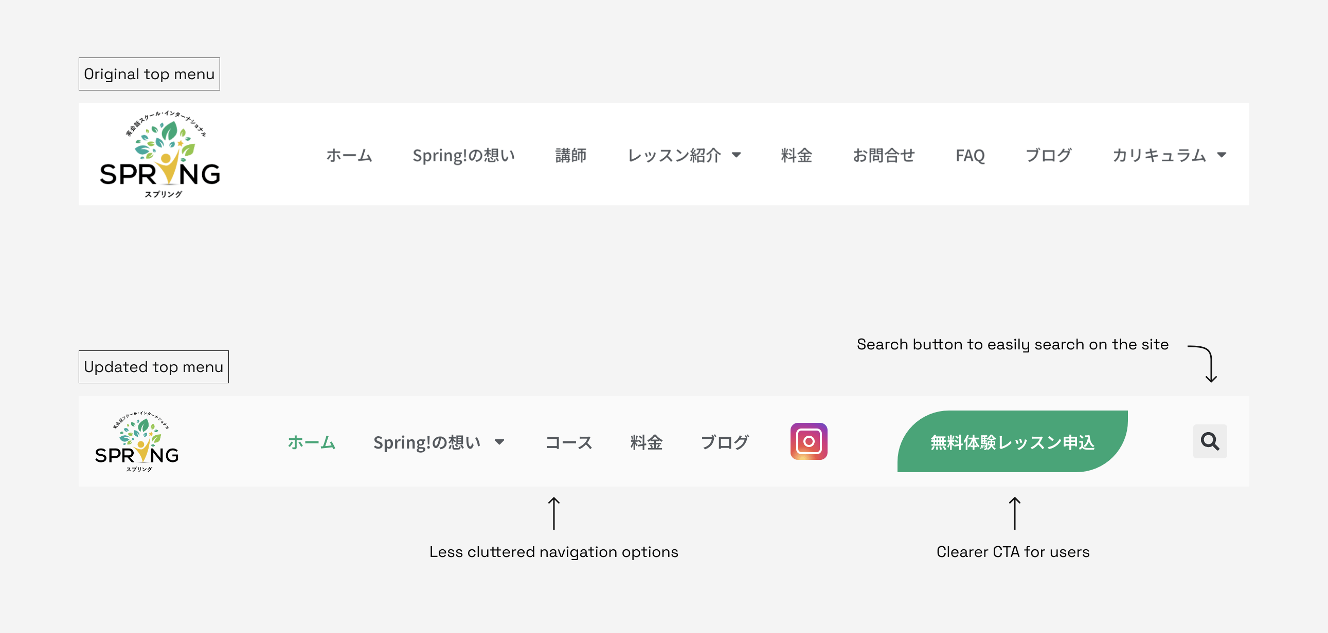
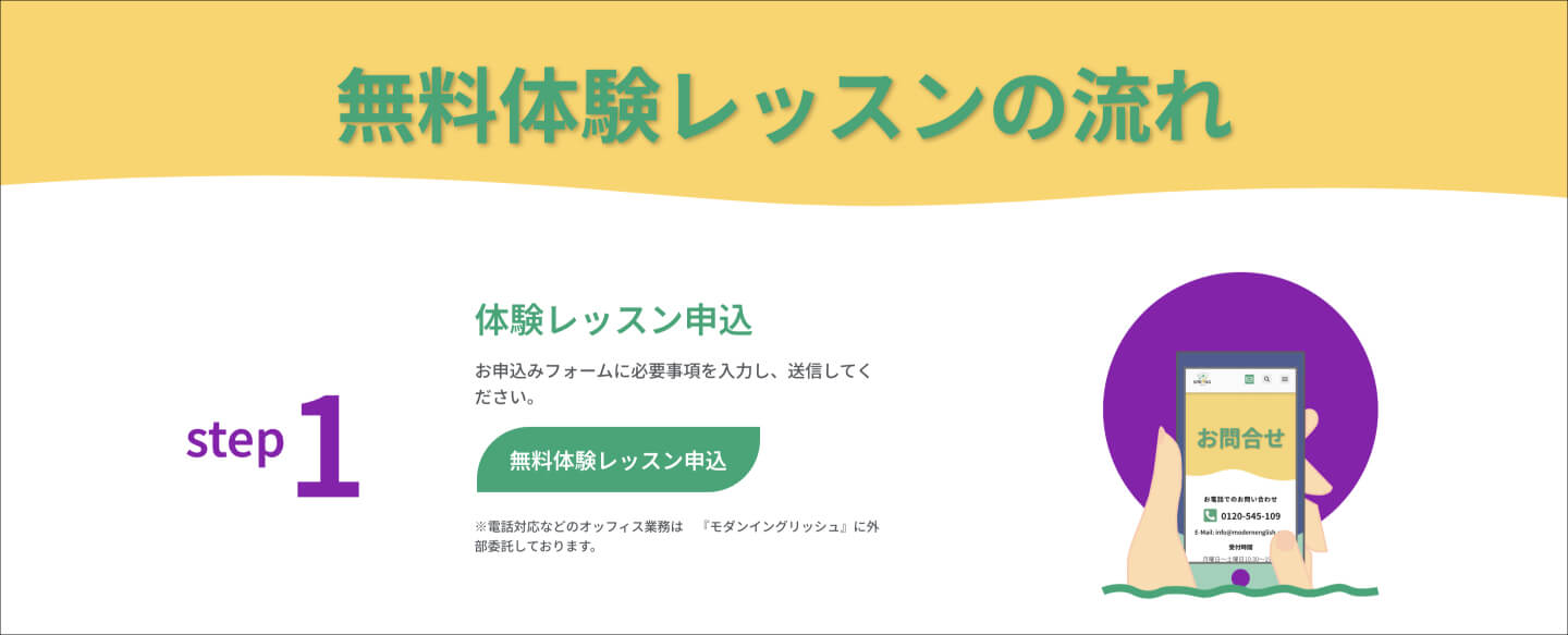
Solution 2: Streamlined Navigation and Clear CTAs:
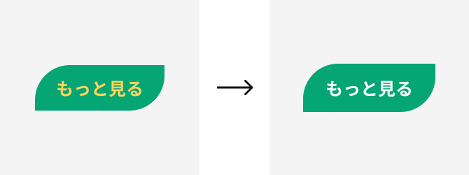
To tackle navigation issues, we redesigned the top menu by including only crucial links. This simplified menu ensured that visitors could quickly access important pages without confusion. We also revamped CTAs, making them more visually distinct and guiding users effectively through the website's key areas.
Solution 3: Enhanced Accessibility and Inclusivity:
To improve accessibility, we adjusted font colors to ensure high contrast for better readability. This change significantly increased the website's inclusivity, making it more user-friendly for people with varying visual abilities.
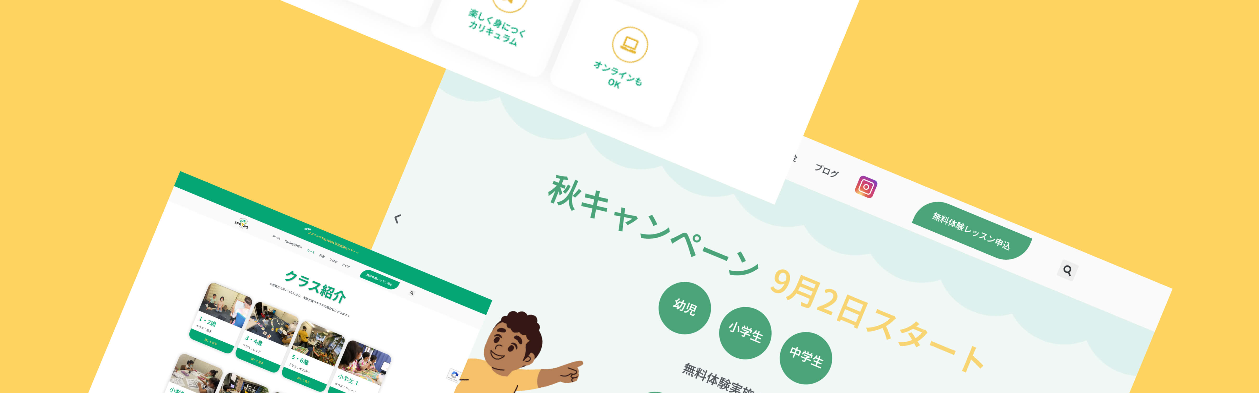
Mockups
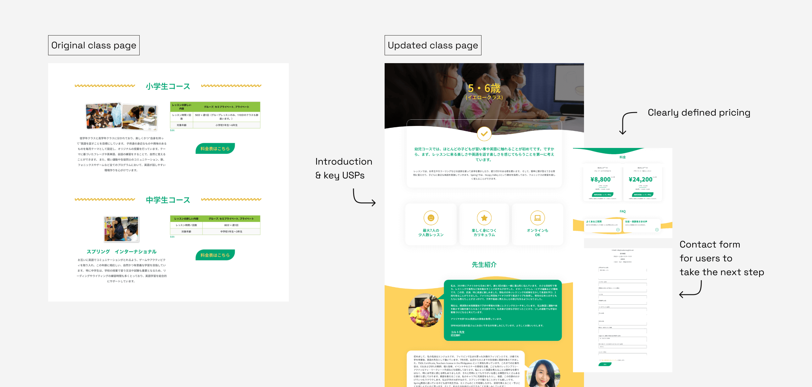
Class pages before & after redesign
To improve the user's ability to find the information they’re looking for, we created separate pages for each class, with detailed information about the class, pricing and how to register. This made it easier for users to navigate the website and find the information they were looking for.
Other mockups
Takeaways
By addressing the design shortcomings and navigation challenges, while also enhancing accessibility, the Spring Learning website underwent a substantial transformation. The solutions applied in this case study not only modernized the website's look but also provided a smoother, more engaging user experience, aligning with the school's friendly brand image and catering to a wider audience.